I just received another of those newsletters. You know the ones: Buy These Books, Bargain Books, E-Book Specials… When you read as much as I do, you hunt up bargains. And so I faithfully peruse the four or five presented each day.

And what happens at first glance? The covers either work…or they don’t.
Today’s were all failures. If they were professionally done, they were failures in taste. If they were homespun, they were still failures in taste.
Of course, that is my taste we’re talking about. You may have loved one and all. To be honest, I bet some of you did like them, and I say that based on the “gorgeous cover” comments I see in social media for covers I think abysmal.
Which brings me to the questions for today. What are your criteria in judging a cover? Will you buy a book even if you hate the cover? And if so, why? What would make you take a chance on a book if not the cover?
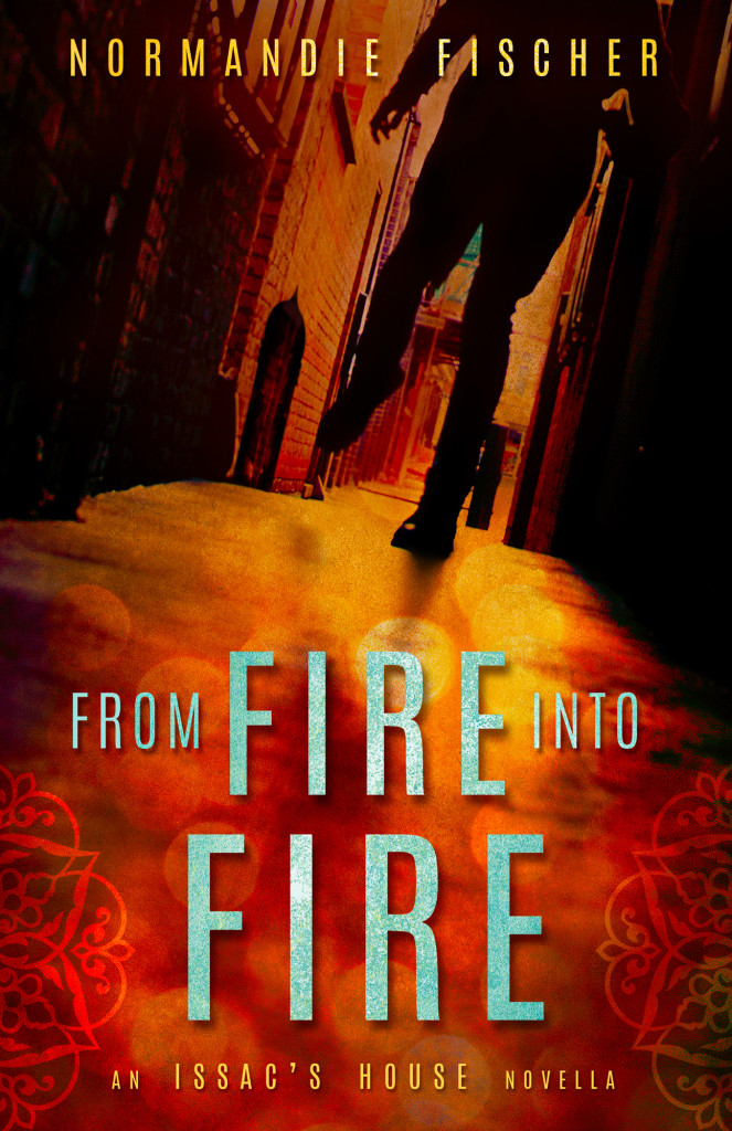
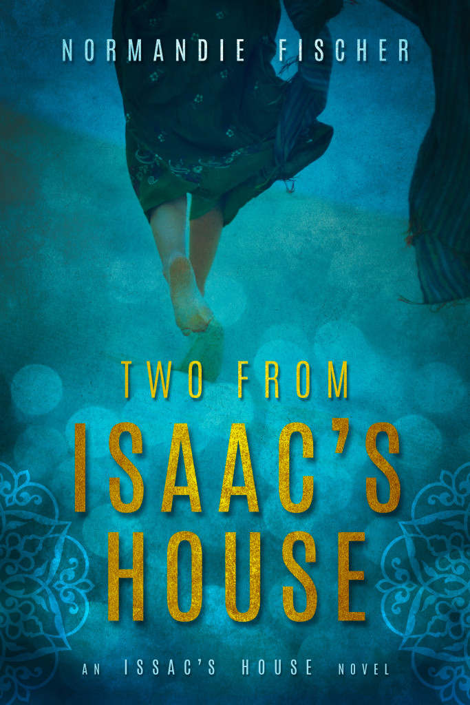
And just for fun, I’ll post my latest covers, designed by the talented Jenny at Seedlings. Would these prompt you to stop, maybe even buy one or both?
WHY?
Please tell me in the comments section. I’d like to know.

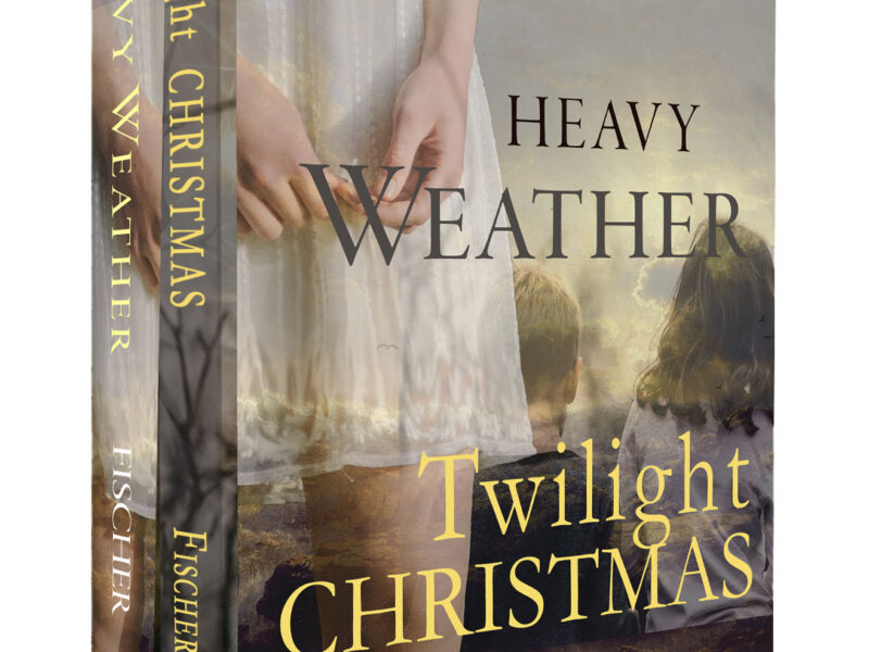
This will be the baby sister for my latest:


You know I love your covers! Jenny did my mystery covers, as well, and she’s so gifted at working up something that will draw the eye and hint at the story inside (but only HINT, because it draws us in!). I agree, a shoddy cover tends to impress me negatively–I know cover art can be pricey, but there are ways to get a great-looking cover cheaply, if you check with friends/family, etc. Basically, a shoddy cover seems to say the author didn’t take their book seriously enough to work up something eye-catching and professional, so probably the book itself will read that way. Not in every case, I know, but so many people will simply skim over a book with a photoshopped-looking cover. I believe cover art is very important because I know great covers can make inroads where shoddy covers cannot (especially where reviewers/libraries/bookstores are concerned).
Exactly, Heather. We want to be taken seriously, and we want to be read.
I consider myself fortunate with all of my covers, although only these two were designed by Jenny. My publishers did a great job, and I’m pleased with my effort on Heavy Weather. I’m an art school grad who knows something about design, although I’d be the first to admit that I don’t know as much as Jenny.
To me, a good cover is an investment in work that contains our sweat and tears. No one will know if our writing is any good if they don’t stop, look, and read, will they?
I love these covers! There is something so mysterious and intriguing…you just know there is something lurking in he shadows. I am drawn to covers when I’m at a book store, and I bet there have been wonderful books I missed because the covers didn’t grab my attention. When I was a teenager, I loved reading gothic romance, and my younger brothers said that all my books showed a woman running away from a castle….they were probably right!
Fun, Susan. I love the standard women’s fiction covers best, but if we’re dealing with romantic suspense, I like a bit of intrigue too. And those gothics would always have to have a castle and a frightened woman!